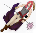
Fire and a Rose

Posted May 14, 2006, 2:35:57 AM UTC
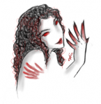
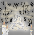
T.T The last thing I drew before my Open Canvas 4 trial expired. DX

I added the words:
I hate you
because
I can't
stop
loving you

on it, but my trial expired before I could save. I took a screen shot, but it's poor quiality so I'm putting up this one instead. v.v

Post a comment

Constructive Critique requested.

Please login to post comments.
Comments

  • May 14, 2006, 5:38:10 PM UTC
    Maybe it's because I'm the biggest angst monkey to ever set foot on our planet Earth, but I am absolutely in love with this picture. And I have to agree with Araht in saying that I really think more color may make the pic look ... not as good as it is now. Favorite
  • May 14, 2006, 7:28:10 AM UTC
    I think perhaps she doesnt use any light because it is meant to give the illusion of total darkness. If you were to add light then the vague and simplistic red coloring would be taken away and in personal opinion, would ruin the picture.
  • May 14, 2006, 4:00:34 AM UTC
    It's too bad it expired on you. That rips that it would cut you off in the middle of a session. As for crit, it would be more effective if you could give more sence of light into it- maybe some oranges and yellows. It's very hard to see anything in this.

    For example http://www.deviantart.com/deviation/5410362/ This has a dark blue background, but there is a clear sorce of light, even though alot of it is shadowed out. A little light in the background helps to push an image forward in this case opposed to other cases where it pulls it back Smile
    • May 14, 2006, 7:32:47 PM UTC
      It's not supposed to be very clear. THink of... hm... impressionalist painting. It's not clear, it just gives you the general idea. =3
      • May 14, 2006, 8:26:02 PM UTC
        Hmmmm- it still should be clear as in you can see it. Red is the darkest hue- photocopiers when printing red blue and green of the same brightness level prints out red the darkest, which is why people that don't want you photcopying information put a red background on stuff. It's got the shortest wavelength- close to black, with no wavelength. Maybe you need more red in the picture so that you can see that something is there is closer to my point. I had to concentrate to see what the picture was, and if the veiwer needs to do that, then it's broken the illusion or messege or what ever you're trying to convey to the person.
        • May 15, 2006, 2:50:12 PM UTC
          I see... I'll probably do something about that when I get another art program. I see colors weird. In one eye everything is tinted green and in the other everything is tinted red, though I don't know if that means I see this differently. I can see red against black better than I can blue, though. I always thought blue was the darkest...
          • May 15, 2006, 3:15:55 PM UTC
            Blue is a cooler colour, but I think you'll find this to be true if you compared pure colours- we have mostly blue respeptors in our eyes. If an Earthling was to go to my world- Phauroraland, it would take them a month to get into a sleeping routine due to the sky permanently being red. It's an unusual colour to look at. Blue and green are the easiest to compare against. It's also why jpg images blur the heck out of red- cause it can be sacrificed for size :nods:
            • May 15, 2006, 3:23:09 PM UTC
              o.o Well, you seem to know what you're talking about, but I'm kinda lost... so I'm just gonna kinda sit here, smile, and nod. *does so*
              • May 15, 2006, 3:39:49 PM UTC
                Sorry- stuff I've picked up. Basically, it's easier for our eyes to see the colour blue than red Smile
                • May 15, 2006, 4:15:31 PM UTC
                  O.o It's always harder for me to see blue... red just stand out more to me, but I'll keep that in mind. Or try to...if my memory will let me. ^^,
  • May 13, 2006, 7:46:14 PM UTC
    My goodness! I love it!! The darkness with the red makes this look so interesting! I love this nice work! very sad though! Smile Great job again!