
Concept Art WIP
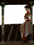
Just wanted to get some feedback and critique on this. It's an assignment for my concept art class. I still have to do the background, but I wanted to see what you think of it so far. Anything I need to fix?
EDIT: To clarify things, since my brain was kind of fried when I posted this, the concept is these people live on this planet that is uninhabitable, except for this two mile wide hole in the ground, and they have no idea just how deep it is. They extract this ooze stuff that is really valuable, using robots. (I missed the first day of class when they descussed what the world was like. this is what I was told when I got to class the second day.) The inspriation behind this character is a combination of Egyptian and North and Central American Indian styles.
I've chosen to make her a sort of sentry in a guard tower towards the rim of the hole.
Post a comment
Constructive Critique requested.
Please login to post comments.
Comments
Art RPG
Characters
Share
Tags
More art by AtalantaAsahoshi


Visibility
- ✅ is visible in artist's gallery and profile
- ✅ is visible in art section and tag searches
OK... I'm not going to crit the linearts, cause they're ok. A little rigid, but ok. the shading though... First you need to decide what the subject of the picture is. If it's the guy, then he should be the brightest and most colourful. If the world is the subject, then he should be darker to make the world stand out first.
Once you have a subject, then you find your blacks and whites (shading and highlights). You find them by choosing a light source. If you want to highlight the guy, it'll be in the room. Maybe firelight. The world? Sun light or moon light. The intencity of the light and colour will soulve your initial colour choice issues. Bright light has a bright highlight and an equally as dark low light. If your light source blocks out or highlights too much, then introduce another sorce. Shinny object reflect alot of light at it's highest peak, and shadows at it's lowest peak, and it tends to have the dodge and burn effect that photoshop uses. Matt items refect a little light so contrasts are lower, but the shadows and highlighs gradually convert over to the base colour. Hair is glossy, clothing tends to be matt.
It's best not to use white in a picture unless you want to make a statement. White is void of colour, and draws the eye too much cause it makes us alert. A soft colour of any sort is always better than white if you don't want a sterile picture. There are always exceptions to this of course. In nature however, pure white does not occur. Even in light (cause white is very bright blue)
Um... that's all for now. Hope I replied on time ^^; Sorry if I didn't.