
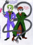
The Joker and the Octopus
Just in time for the summer blockbuster "The Dark Knight," the Master Planner presents fanart with the two scintillating, scene-stealing supervillains from the most stunning superhero sequels in celluloid history.
Now that I've run out of alliterative terms, here's the standard disclaimer: This is fanart, and I don't own these two. Nor would I want to. They're not very nice people.
Post a comment
Please login to post comments.
Comments
Art RPG
Characters
Share
Tags
More art by 4212

Visibility
- ✅ is visible in artist's gallery and profile
- ✅ is visible in art section and tag searches
OK- wouldn't know if you want me to point out all the issues since you haven't chosen roast me as the crit option, but these are what strike me enough to mention-
*Refill lines. Yuo'll be asked to resubmit this without the lines (since it's not with in the submitting standard of PD- they're easy to remove though
* Felt tip pens- I like that you have nice even lines with the pens- most people scrible and it looks blotchy ^^ However, try to make your strokes longer, or maybe make the whole stroke quick- I think what you're doing is making exact lines which does make it neat, but leaves those more saturated areas where the two rows of ink pens meet and make a brighter colour. if you flick off the end quickly, it may not combine so much. Remember you can add more felt, but you can't take it away easily. The next step up from felts is copics. they're expensive for some brands, but you get a nice even finish with them. They're gooooood :3 *purrs*
*Background- Or a lack of. Sometimes you can get away with a plain background, but 9/10 times, having SOME sort of colour is beter than plain white. Don't waste you felts on it thoguh- I suggest coloured pencils. It doesn't need to be bold. A pastel colour to add some warmth or cool or something is all that's needed. 8/10 having a simple scenery behind the character also helps alot too
I don't want to comment too much further than that till I know what you want crit on, cause art style gets personal sometimes and I want to know where you sit with it. That's a start though, right?
The markers are plain Crayola. I'll try the tip you gave me, but if you could tell me where I could buy copic markers and how much they usually cost, then that would be helpful indeed.
I'm also looking into buying colored pencils.
Thank you, again, for helping me out with the quality of my art.
--The Master Planner
Coloured pencils is a cheaper option for getting smooth colour in your art in a traditional way. They're more effective when used like a pencil rather than as a solid area effect- I use to use pencils alot for colouring, like in this- [thumb406] IT looks good at a distance, but up close, nothing beats a good solid colour for cell styled shading. Sorry if I seemed a little critical with that ^^; lol. Didn't mean it harshly if I did...
Don't worry about critiquing me; I know you only intend to help me improve. It's like Simon Cowell's role on American Idol--it's better to be brutally honest than to receive a lot of empty praise that only sets one up for a bigger disappointment.
Hence, the art thieves that proliferate, like maggots on poo, in websites like this and DA. Recently I had a problem with someone stealing one piece of my Octopus fanart. I reported it--and turned out that I had followed a tip I saw somewhere on PD's forums--and along with my signature, hidden the words "Pier 56" in my lineart.
...busted!
Of course there are some artists who don't want *any* critique. I've written one comment on DA saying very politely, "This looks great, but personally, I would slightly fix the perspective, and (blah blah blah). Other than that, it's really good. Keep up the good work." And got this reply: "F*** off. This is my style."
But for my part, I like to think I've improved since I first started drawing. And I owe part of that to the helpful friends with their constructive critique.
--MP
I mostly draw for pleasure, because I'm well aware that my true talent lies in the written word.