Dremma Devghan - Color

Posted Apr 28, 2004, 8:39:57 AM UTC

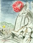
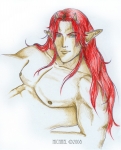
This was my very first CG. Not too shabby bad for a first try. I'd hope to repost the newer version in due time. The bigest changes are the hair - more texture in the hair getting rid of the blockyness, iliminating the thick contour lines, and I got rid of the scary hands! Heh - funny how things change.

I'm no longer actively seeking crits for this image.  However, if you have something to share please do.

Post a comment

Please login to post comments.
Comments

  • Feb 5, 2010, 4:41:43 PM UTC
    He's gorgeous! He has a very commanding presence and I love how you draped the cape over his shoulders.
    • Feb 7, 2010, 9:23:42 AM UTC
      Thanks! I had fun shading his cloak. it was diffucult, but rewarding.
  • May 24, 2005, 7:32:58 AM UTC
    That's awesome. You did a great job on him. He looks pretty hot. *winks* You know, for a demon. *smiles* I especially love the subtle hint in the center of the flap. Ooh,la la. I really like the colors in the background. They flow so beautifully together. Great job.
  • Apr 5, 2005, 5:25:55 AM UTC
    Wow, the shading and colors are realy well done and this is your first CG?!
    • Apr 5, 2005, 8:57:12 AM UTC
      Yes, this was my first. Took me three days! I'm working on improving my techniques.
  • Jan 2, 2005, 3:20:40 AM UTC
    Oh yeah cuteness!
    He's handsome!
    Sugoi!
    his body is so delisyoso!

    Nice job good try
    damn me not try that yet.

    The hands needs improvement though...

    • Jan 5, 2005, 8:17:15 PM UTC
      The hands need improvment in what way?
      • Jan 15, 2005, 2:12:54 AM UTC
        Make it more precise and with much more detail or manly looking... the fingers ain't much nice too look that's all but the rest is Cuteness... and totally yummy
        • Jan 15, 2005, 9:38:21 AM UTC
          Way ahead of you... I redesigned his hands a while back. ^_^ I'm working on coloring the new version. Perhaps I'll post the line art to the sketches gallery.
  • Apr 28, 2004, 9:07:10 AM UTC
    So is this the repost or the first try? I really love the hair! This is a great pic. The background is nice too. I also like the suttle shading on his body. I think it would have been better though if he wasn't so close to the edge of the paper (on the left, right, and top). If you are redoing it, just give some more space around the sides.
    • Apr 28, 2004, 4:28:14 PM UTC
      This is actually a first try. I plan on reposting soon. I'm just looking for first impression and any need for improvements. I do agree the edges of the image are very close to him. Adding some space is certainly a must!