
Dark Faerie
Dark doesn't always mean evil
Post a comment
Constructive Critique requested.
Please login to post comments.
Comments
Art RPG
Characters
No characters tagged
Share
Tags
More art by Miks-Orzo
Visibility
- ✅ is visible in artist's gallery and profile
- ✅ is visible in art section and tag searches

STEP 2: Add to the Queue
Your submission is posted to our site but it hasn't yet been added to an Art RPG queue for point counting, approval, and/or reward redemption. Submit it to the queue to get your rewards.





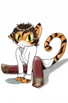
I am tired of people telling me that my art is "wrong" because it's not. I know for my style I often fail at getting things proportionate, among other things, but my style is my style, that doesn't make my art "wrong" just because it's Anime/Manga style. Especially when I've read many stories that were practically abstract in the style of Manga.
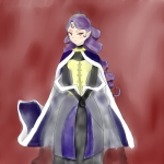
The quality of the colouring- There's a few textures going on in the picture which is some nice experimenting. The texture on her outfit I particularly like cause it has a leathery look about it (I assume this was desired?). There's two issues however that majorly deter from cool little things like that that you have. They're not too hard to fix
- Shading. I can see that you're giving highlights a go with your art which is great. There is some light shadow, but your shadows must be as dark as the highlights are bright. Like, your leather has a real sheen to it but no shadow at all, where as the skin has no highlight, but a shadow. What I suggest you do, is do some studies on shading with colour. You don't have to go hard core on it- just google Shiny surfaces, matt surfaces, high light, low light... stuff like that. Draw it once, and that'll comit it to memory. Draw it exactly as the example has it. Colour to colour. Notice how the gradient progresses in tone, and in saturation from light to dark. It'd be nice to do this for spheres, and cubes so you can see how light reacts when it gets a sharp edge and a soft edge. You don't need to do drills. Just one of each once. I feel this will help your command on lighting ALOT.
-Linearts- I'm not going to question what the lines form, but I'm not sure why you chose to make your linearts a colour that was so hidden. On the lines that touch her body I get why you'd chose a light colour- to soften the picture? This colour is over the whole picture though, even in the darker areas of her body like the hair. I like the purple lines in her hair, but the grey draws your primary attention in this picture. I think that changing the colour of your linearts is a good idea to add a bit of dynamic, but when the lineart contrasts this heavily in an area like the hair where detail is unimportant, and not in areas which are important like the face, then it's a bit much. I'd say that if you lighten a contrasting lineart to a darker version of it's surounding colour and that looks cool then go for it
Different ways to make it look a certain way, for example a way to make a picture look like watercolor- I'm not entirely sure how gimp works. Try googling for tutorials with the key work gimp. The easiest way of replicating water colour is by using the real thing, but you need a painting program like Sai, Corel, or Artrage to do that properly. They have tools pre set up that work exactly like the real medium would work, but digitally. I suppose you could give it a go with a transparent and unsaturated brush. Unfortunatly GIMP isn't a sophisticated program so the features it has are reasonably basic. Artrage is a good cheep painting program. Not sure how expensive Sai is, but Artrage works very similar to real media and better yet, I live 1/2 hour from the peopel that wrote the program!! *isn't pimping Kiwi made products.... no...* http://www.artrage.com/ Artrage studio is $30USD while the professional version is $60. It's a good deal IMHO
Making the hair appear curly- That comes with learning lighting I'm afraid
Pretty much anything you can help with- Two things I think:-
- K.I.S.S- Keep it simple silly
- You have a christmas lights thing going on with your lineart I've noticed. Does GIMP have features in it like threshold? Or layer blend multiply? If you can, use those to change your linearts to not let white dots through. It'll polish up your final quality heaps
I hope this was a help. To be honest, I wasn't going to comment about your form at all. Sure, its got flaws, but it's fine as it is. I don't feel that it's what you need to focus on. Your biggest goals to me would be learning shading (this includes what colours things turn when a highlight or lowlight), and focusing the viewer's attention to the subject of the picture.
I've attached a crit with some of my examples in it. I didn't do shading in it cause it was already very difficult to update the image without a high res with all the layers :< I've given her a golden glow on top of the mods cause I felt it could use some extra punch. As you can see though, it's alot easier to see her
Urgh- sorry about the text wall T.T Again, I hope it helps! I have many more tips after this, btu these are the most important ones to me
GIMP has threshold but not Layer Blend Multiply. I never really thought to use threshold before... But yes that does help allot.
I knew the background was rather to busy, but I like the way it looked so much, and wasn't sure I could get it to look that way again, so I left it, until I figure out how I did it :scratchead:
I do have another question for you(though with GIMP the answer may not work...
Whenever I scan any of my art, I'm always left with massively thick lines, even when I draw lightly and try to keep them thin on paper.
So your lines are thick after scanning? Or during the lineart process? If it's thick when you draw them then the only way to fix that is by starting off with a larger scaled piece of art or a thinner pen (I use a 0.03mm pen at thinnest. IT's like drawing with a NEEDLE). If it's thick when you scan it in comparison to the original, then scan it at a higher resolution (300 or 600 is good) and use threshold to turn it pure black and white. It'll look like shit, but when it's shrunk it'll be pretty and tidy. If you start low res, then your lines will always be obvious. The shrinking process gives the art the pretty antialias look where the program puts a sharp gradient in to make up for lost information. Also, you'll have a nice big image that you can print for a physical record of your art. If you print a shrunken image then it'll either print small, or if you enlarge it, it'll be blurry.. or blotchy depending on if you saved it as a JPEG format. (PNG is lossless, but larger)
Basically, there's not alot you can do post scan to fix it short of redrawing your lines. Photoshop has some dilation tools that would thin them, but not evenly. you could slap it into illustrator and get it to redraw the lines with live trace, but the lines are never quite the same shape, but really, if the master has the flaw, then the master needs the change. There's no simple 5 click method of fixing a thick line save redrawing it.
Personally, I feel your line thickness isn't too bad of an issue. I feel that you could use some variation in line thickness, and if you scanned and worked at a high res, and made sure that your linearts didn't contrast too heavily that you'd be fine.
Tip for threshold-I believe you can adjust the threshold in gimp. If you can, slide the bar along till you get the cleanest result with the least amount of noise, and the least amount of lineart augmentation. The setting it defaults to is 50% being anything less that 50% grey becomes white, and the rest black. If you slide it for an over exposed picture, you can make 40% greys turn black and anything less be white, or visa versa. I think gimp gives you the option. If it doesn't then you'll need to live with getting what you've got.
I actually had this HUGE several paragraph long reply, then I accidentally hit the reply button again, instead of the submit button and lost it all. So long story short:
GIMPs Threshold is adjusted pretty much exactly as you described, a sliding bar and such.
So just the other day I went to the nearest art specialty shop(because Walmart, Walgreens, and Shopko don't sell pens any smaller than .5mm)and the smallest I could find was .05mm and since that was also cheaper than the .1(I think it was) one I got that. I'm hoping that'll make a HUGE difference in line thickness so I can focus better on other aspects that need work.
I swear, my fixation on line thickness is just the OCD coming through, but it's always bugged me, so if the smaller pen is all I need, HOORAY!! Lol
I figure I'll post the picture, because it's a fanart, I like it, and since it's practice I gotta post it