
Survivor
I have made some changes. I moved the arm for a more relaxed form. It seems to look better. I added a face. Not very good but still working on it. It seems to look better on paper. Somehow looked kinda demented now. I redid the shading on the pants for a lighter look. Feedback welcome.
Post a comment
Constructive Critique requested.
Please login to post comments.
Comments
Art RPG
Characters
Share
Tags
More art by applejuice81


Visibility
- ✅ is visible in artist's gallery and profile
- ✅ is visible in art section and tag searches
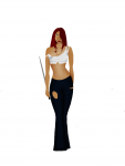
But now for critique, because you do want it.
Make the head just a tiny bit bigger. Like, the chin down a bit and widen it.
I'd lower the eye a bit, study your face in a mirror, and see how it is in relation to your nose.
Study your nose, too. See how the nose on her face looks really flat, and weirdly diamond shaped? I'd make it a bit flatter on the bottom. The, I can't remember the name of it, but the lines from the nose to mouth, don't widen like that on the face, shrink it a bit, and lighten them up. I'd do more of a shadow to show it than lines. You seem to be wanting to not do lines on this, anyway, and it would look better over all.
Move them up a bit.
Her boobs are high, I'd lower those. Boobs hang, and don't have helium in them.
Her left arm, our right, is too thin. Thicken it up. Hold your body in that pose, and look in a mirror. See how it looks? Try that.
Her waist is really too small, but that's a stylistic choice, so you can leave it, or make it wider.
For the tears in the pants, make the edges more ragged. They're really too smooth right now, and don't match your texture you have for the pants.
But! I do quite like it :3 You have a very good coloring style, and I'm really impressed with it.