
Introduction-#1/100
Worked on this from Jan.12-18th I think...it's my first entry for the 100 themes manga challenge. And I hate to say it, but my scanner was being stupid, I was too lazy to do anything about it, and thus you get a really bad, low-resolution pic of what is actually a very nice piece. I say that because I love the color. It's mostly earth-shades and by god I love it. But it's still open for roasts. ~_^
Post a comment
Constructive Critique requested.
Please login to post comments.
Comments
Art RPG
Characters
Share
Tags
More art by eegirlee


Visibility
- ✅ is visible in artist's gallery and profile
- ✅ is visible in art section and tag searches
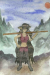
Firsdt thing that pops to my mind- the hand. It's not how it's drwn, but the thumb should be on the other side of the stick- the thumb works best opposable, expecially on that angle.
I like the frosty glow betwe nthe mountians- that's a nice touch. You use a referance for that? What was it I read in a perspective book- atmospheric distorion or something.
I think the forground ground needs a solid texture, or something that is sharp and accurate to give it a sence of 3D
I also reckon you could use some pure white water colour, or slightly watered down stuff to accent the clouds a little
Hope that helps
No reference for the picture-I was just thinking of the backrounds DaVinci used, with his chiaroscuro technique? And I thought-"that looks like her world" and added some pointy mountains.
What do you mean by adding texture to the foreground?
Hands aren't too hard if you remember that the thumb is opposable. Try the poses on your own hands first- photograph them so you cansee them if you must. Everyone hates hands. Including me. That and shoes. That's why all my shoes are masses of black unless I have to make detail ^^
So I guess my way of trying to make her look small is just shortening things. :/ I'll work on it.